WEDDINGS
BESPOKE
TEMPlATED
GETTING STARTED
arrow_back
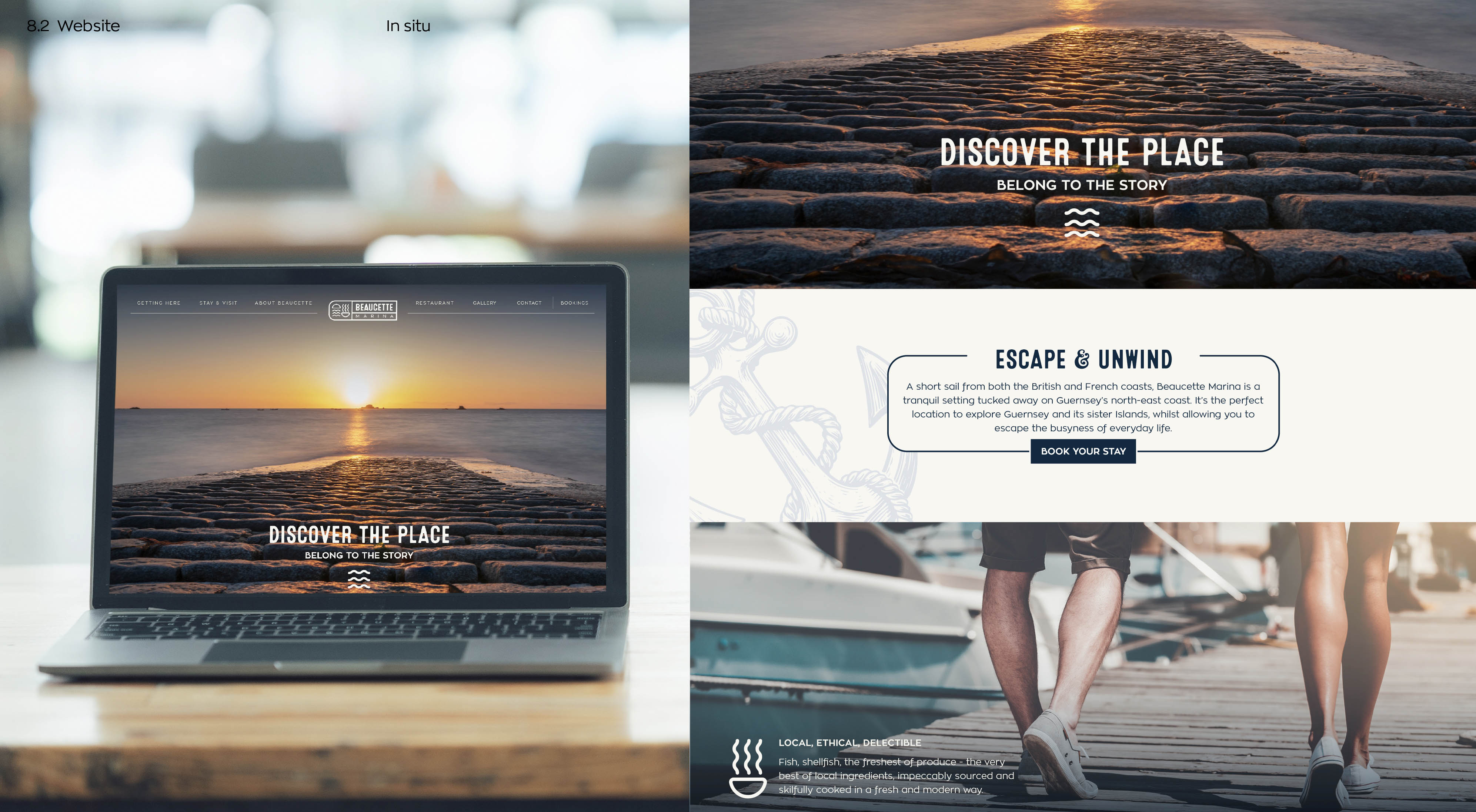
When Beaucette Marina came to us, they weren’t just looking for a new logo. They wanted to create a sense of place.
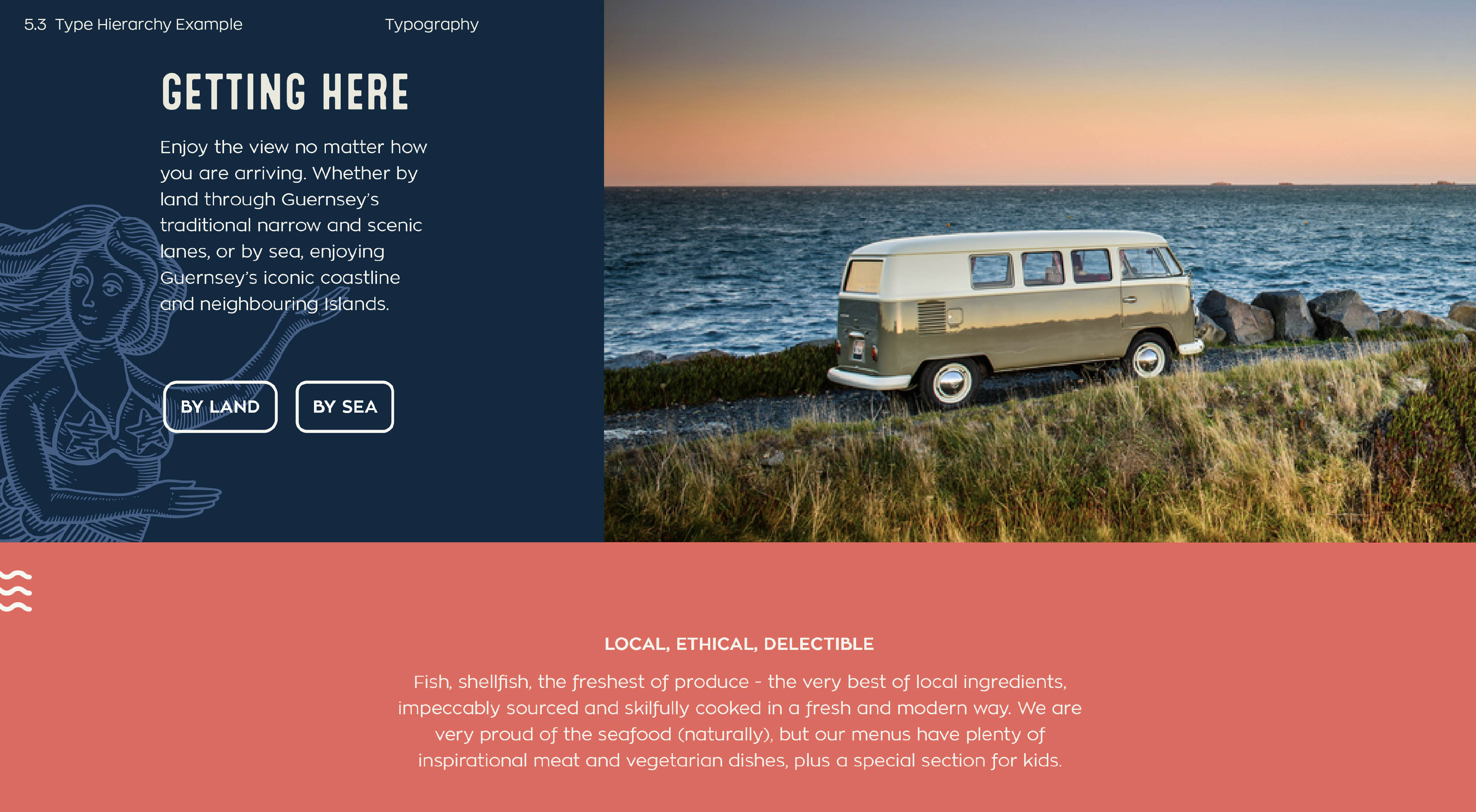
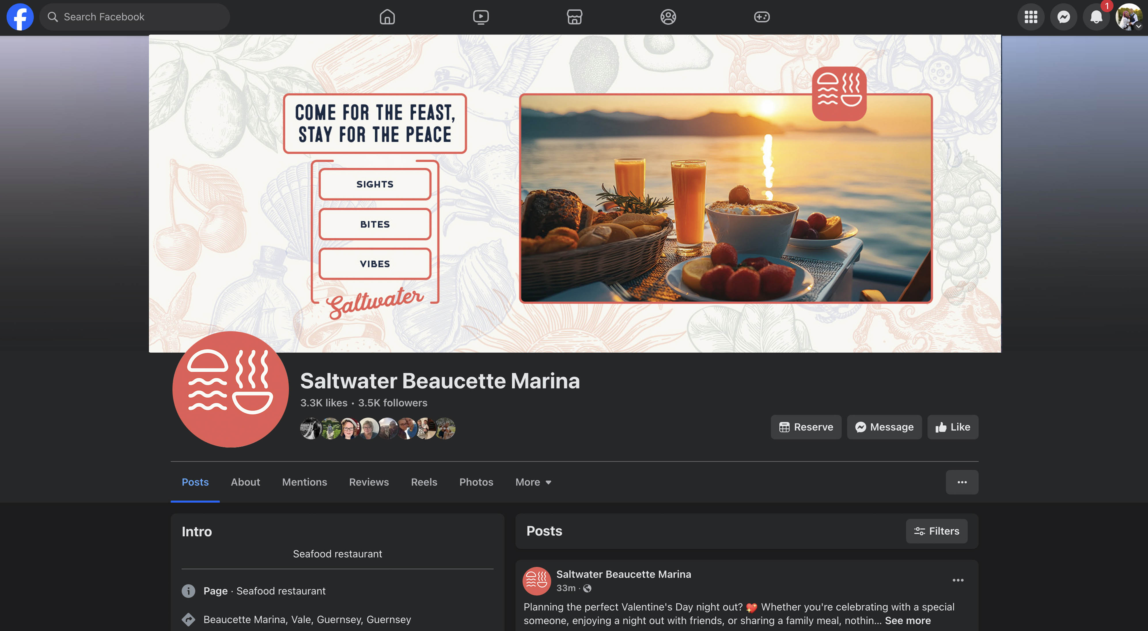
Beaucette sits on Guernsey’s northeast coast, the only spot on the island where you can see all five Channel Islands and even France on a clear day. It is stunning, but it had a problem. Locals didn’t really think to visit. The on-site restaurant, Saltwater, felt separate from the marina. The two brands didn’t speak to each other and there was no clear story pulling people in.
The owners wanted to change that. They imagined an umbrella brand that could bring everything together — the marina, the restaurant and future spaces or events. They wanted Beaucette to feel like a little escape, a place to recharge and spend time with family or friends, even if you are only there for lunch.
What We Were Solving
We created a connected brand system: one clear umbrella identity for Beaucette Marina and a flexible sub-brand style that started with Saltwater and could expand to new spaces in the future.
Our focus was to:
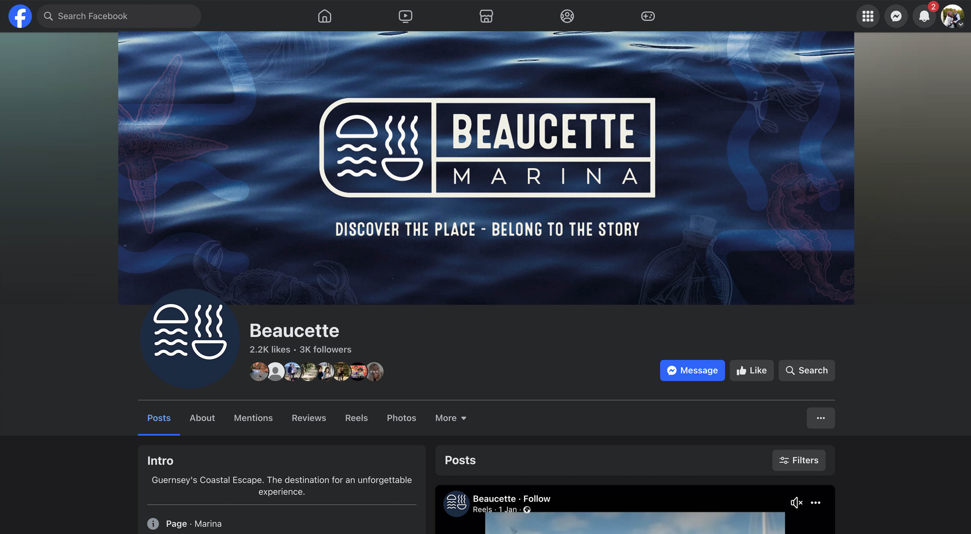
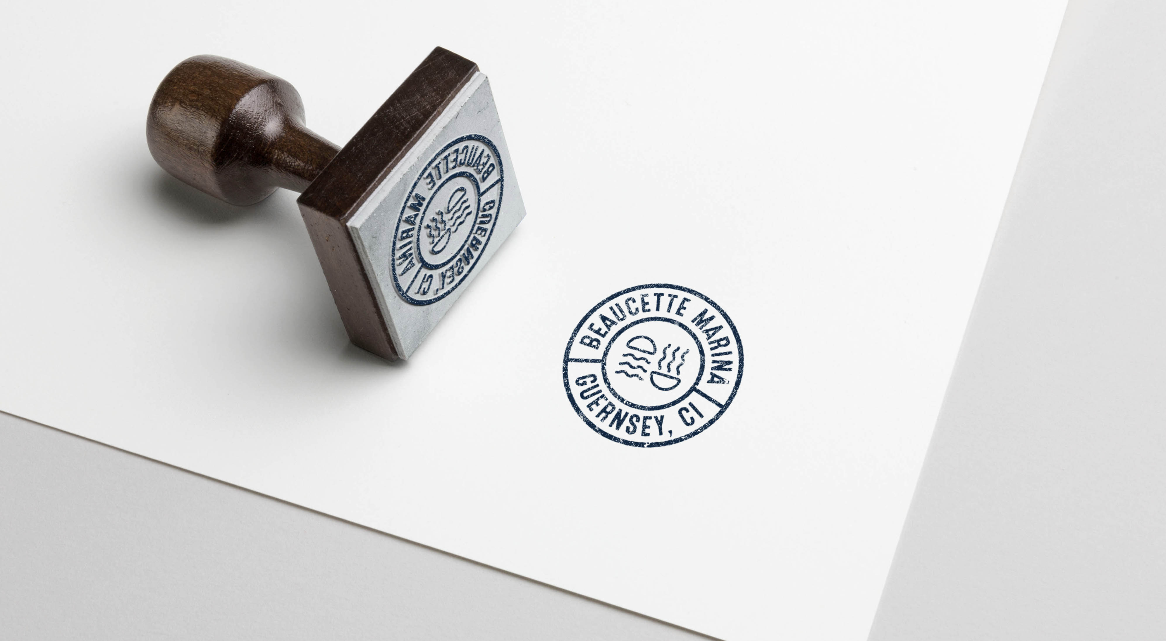
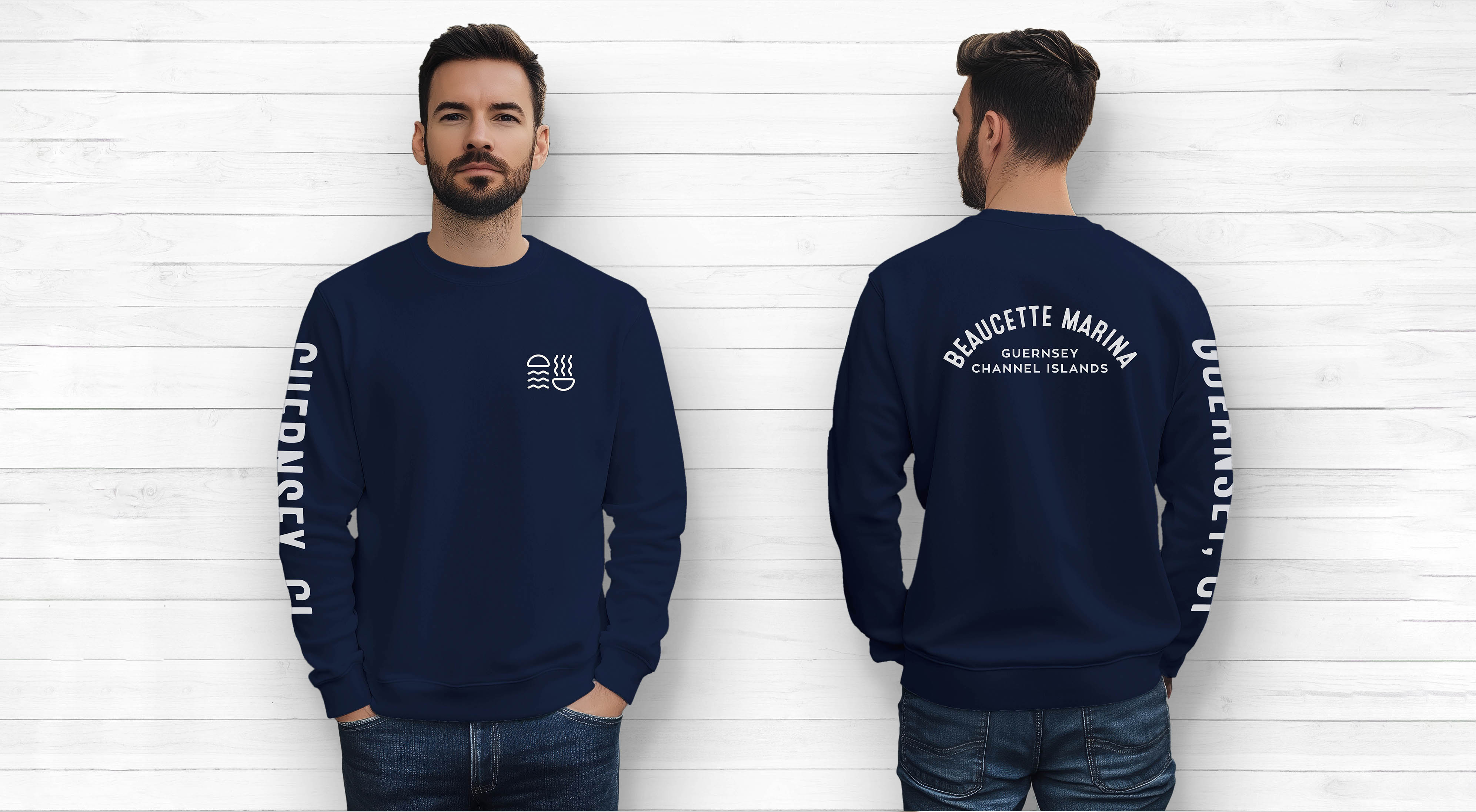
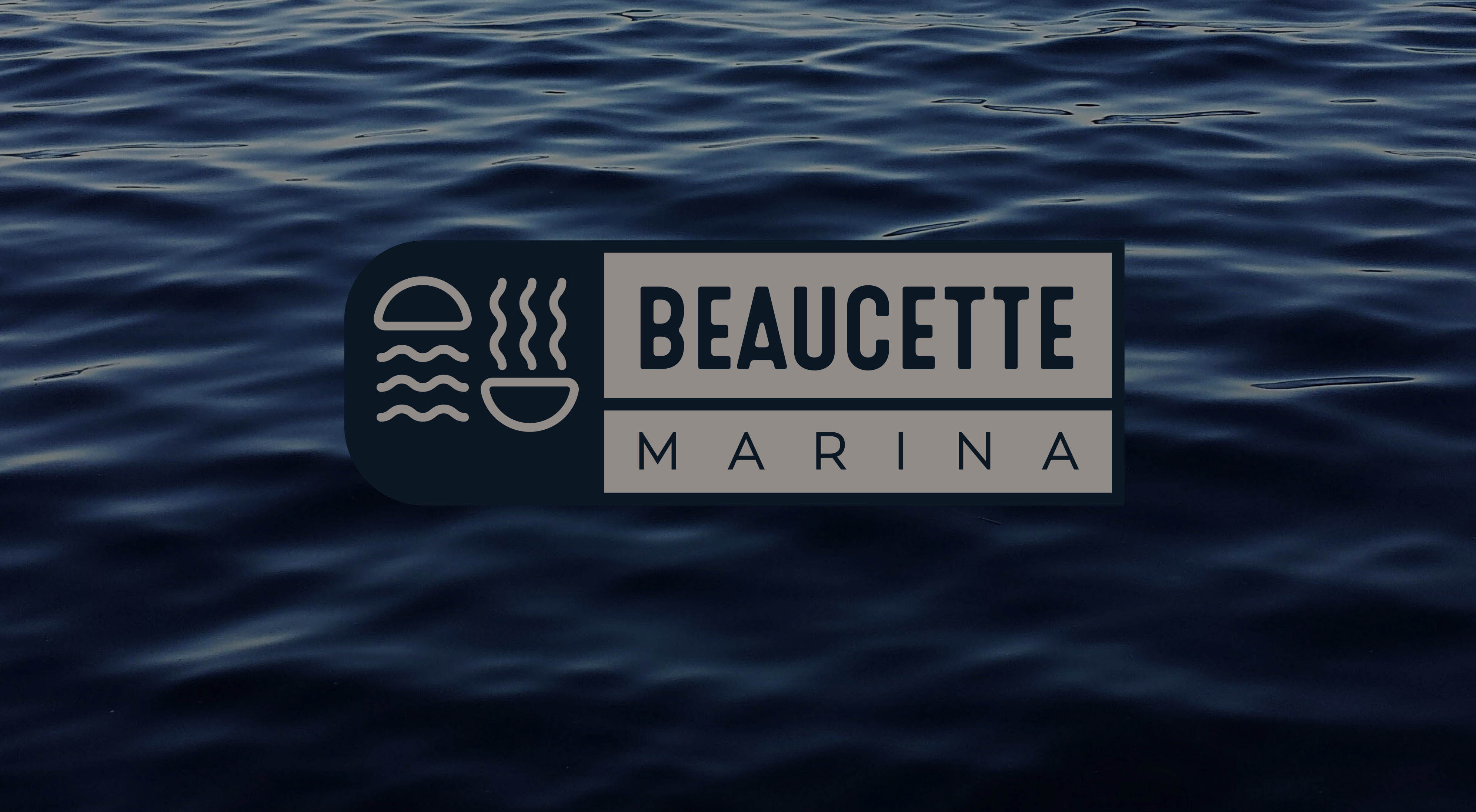
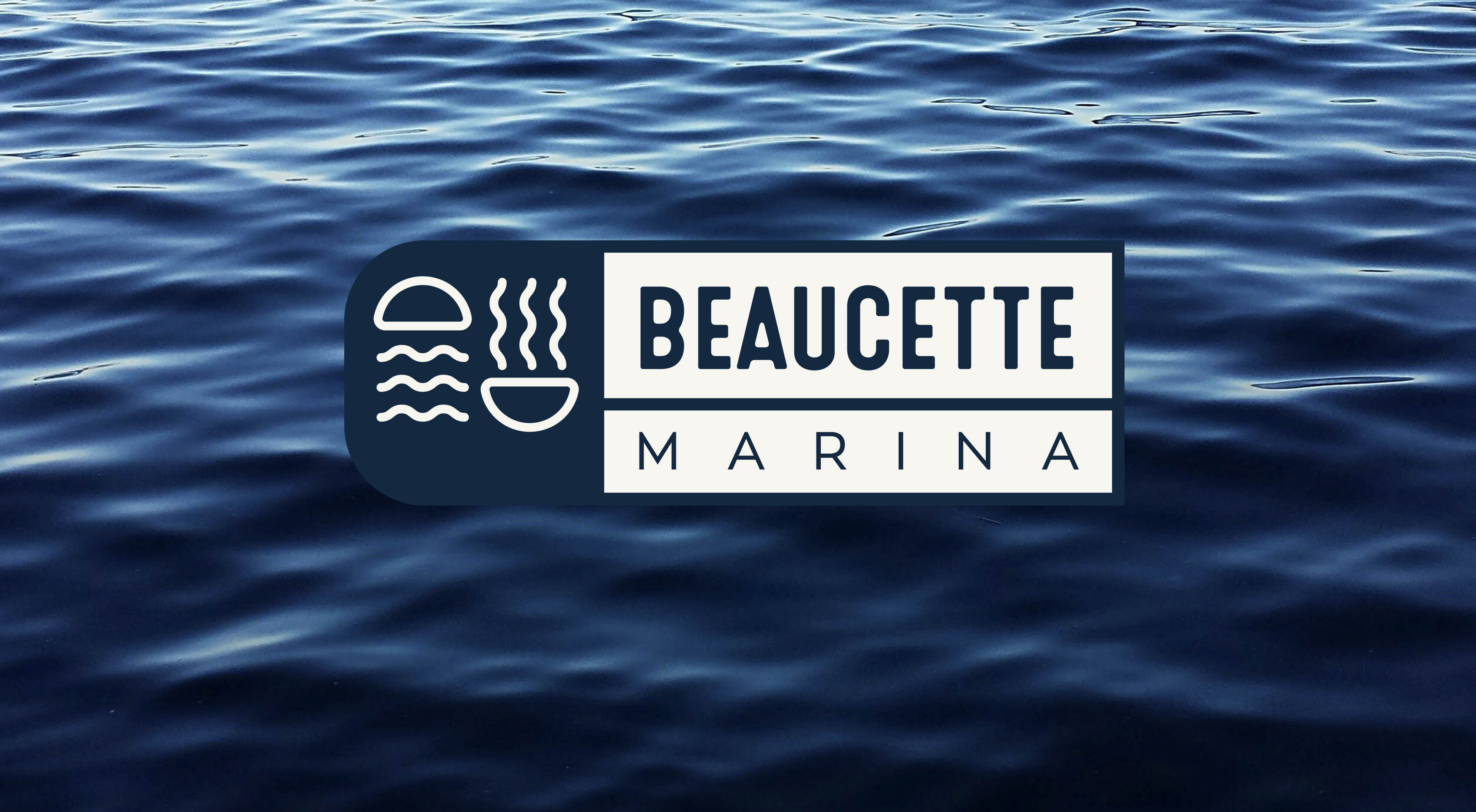
A shared icon
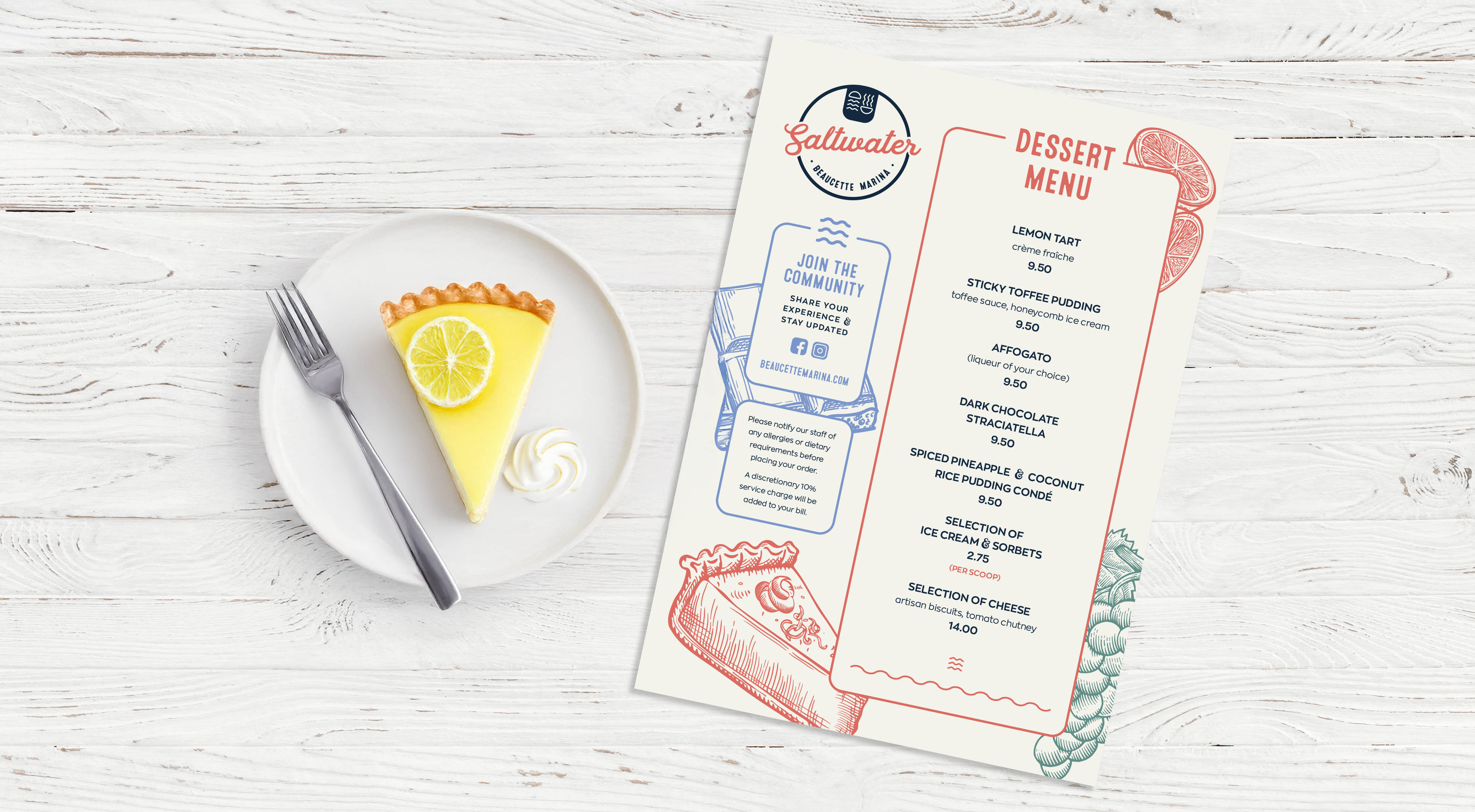
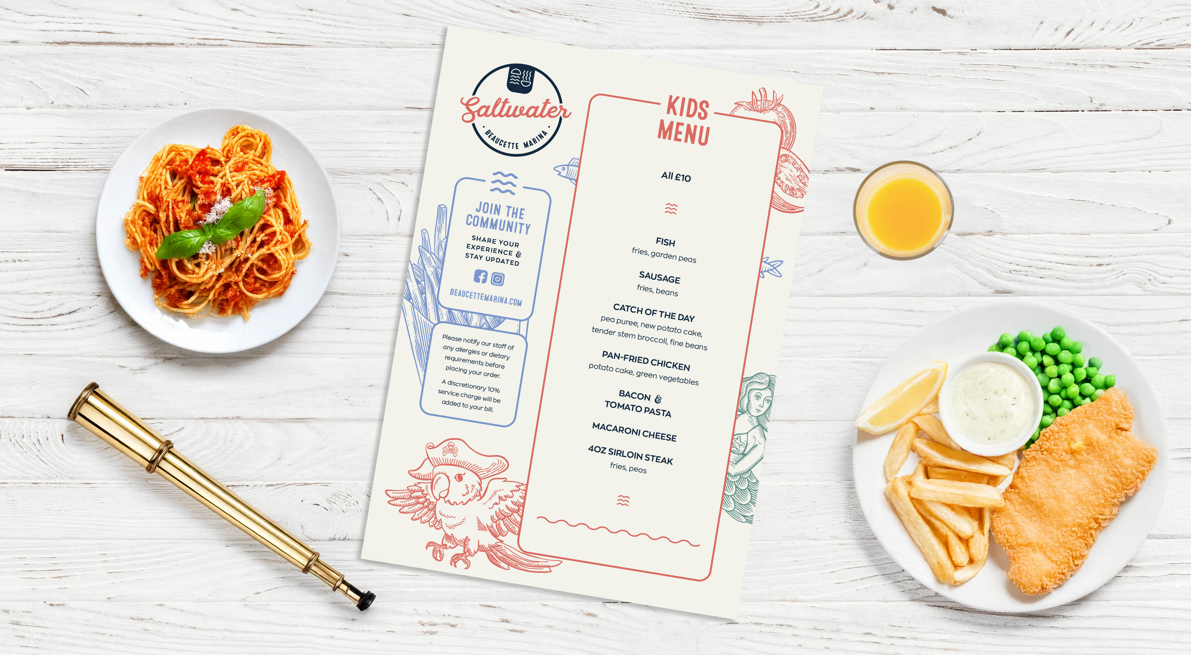
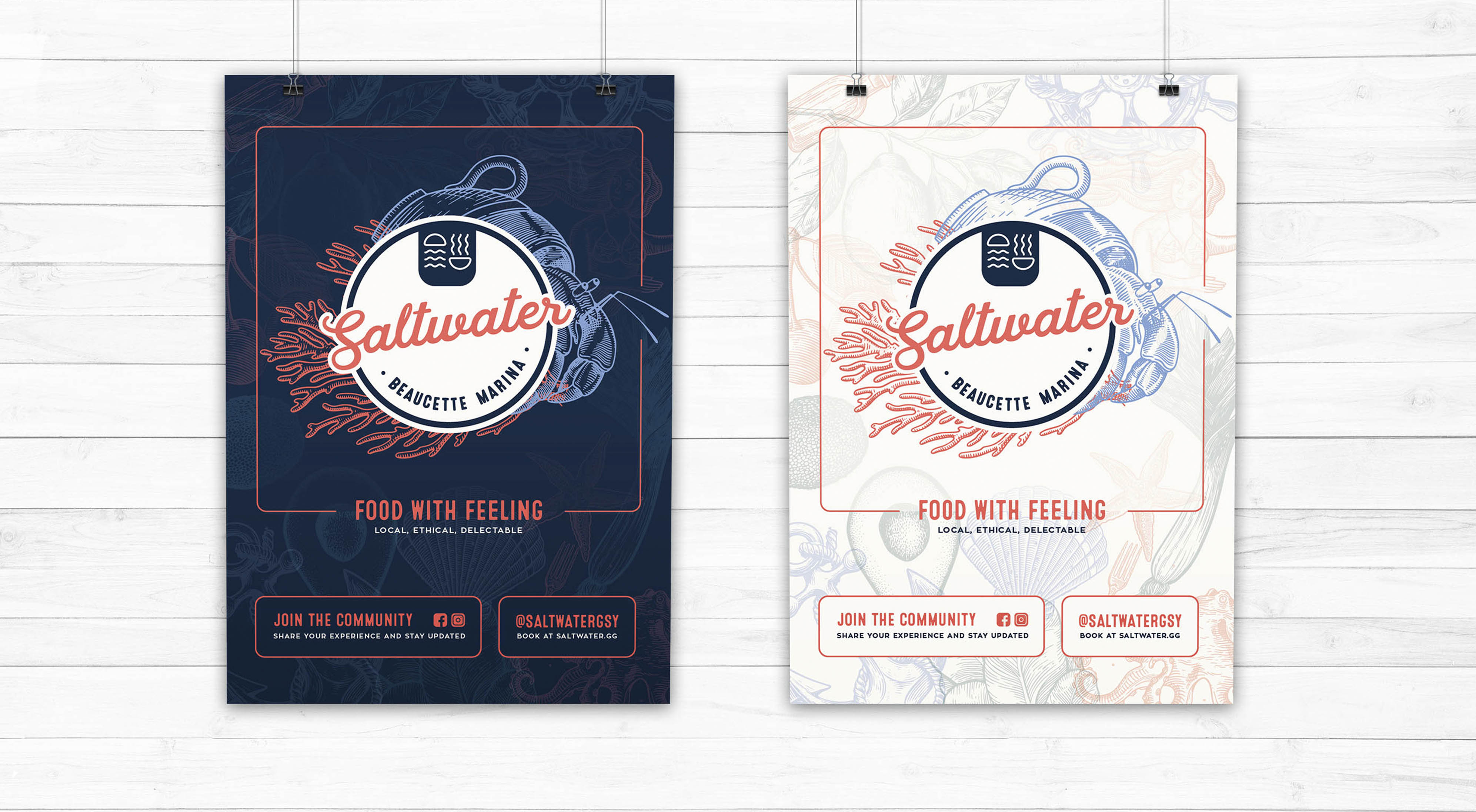
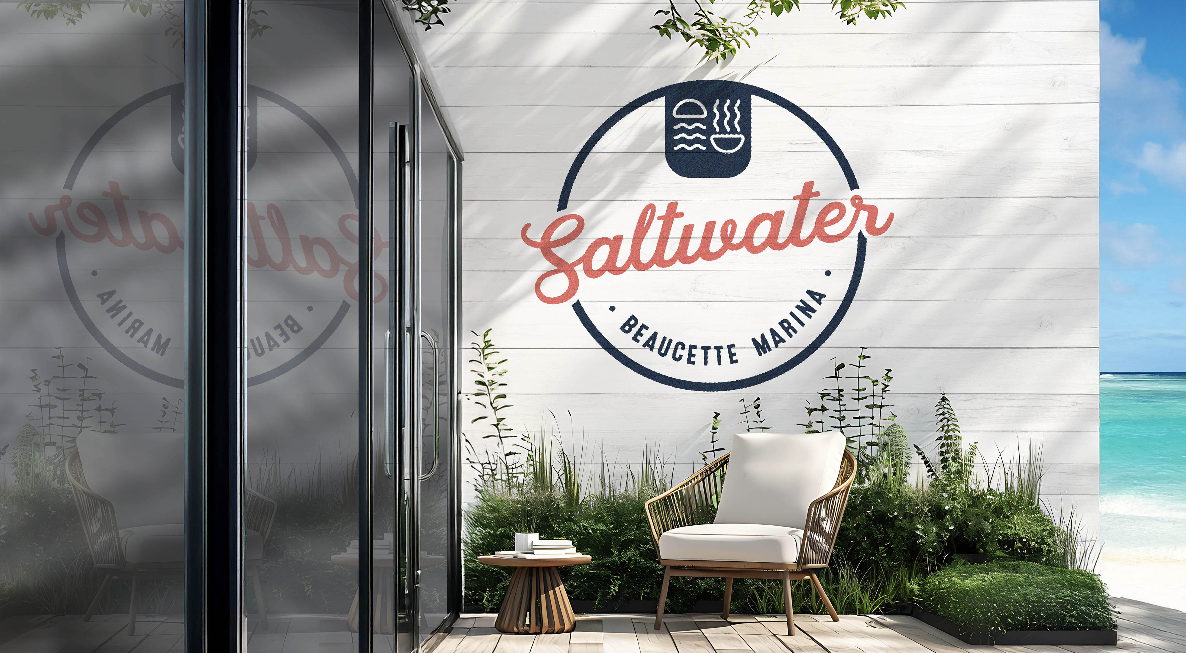
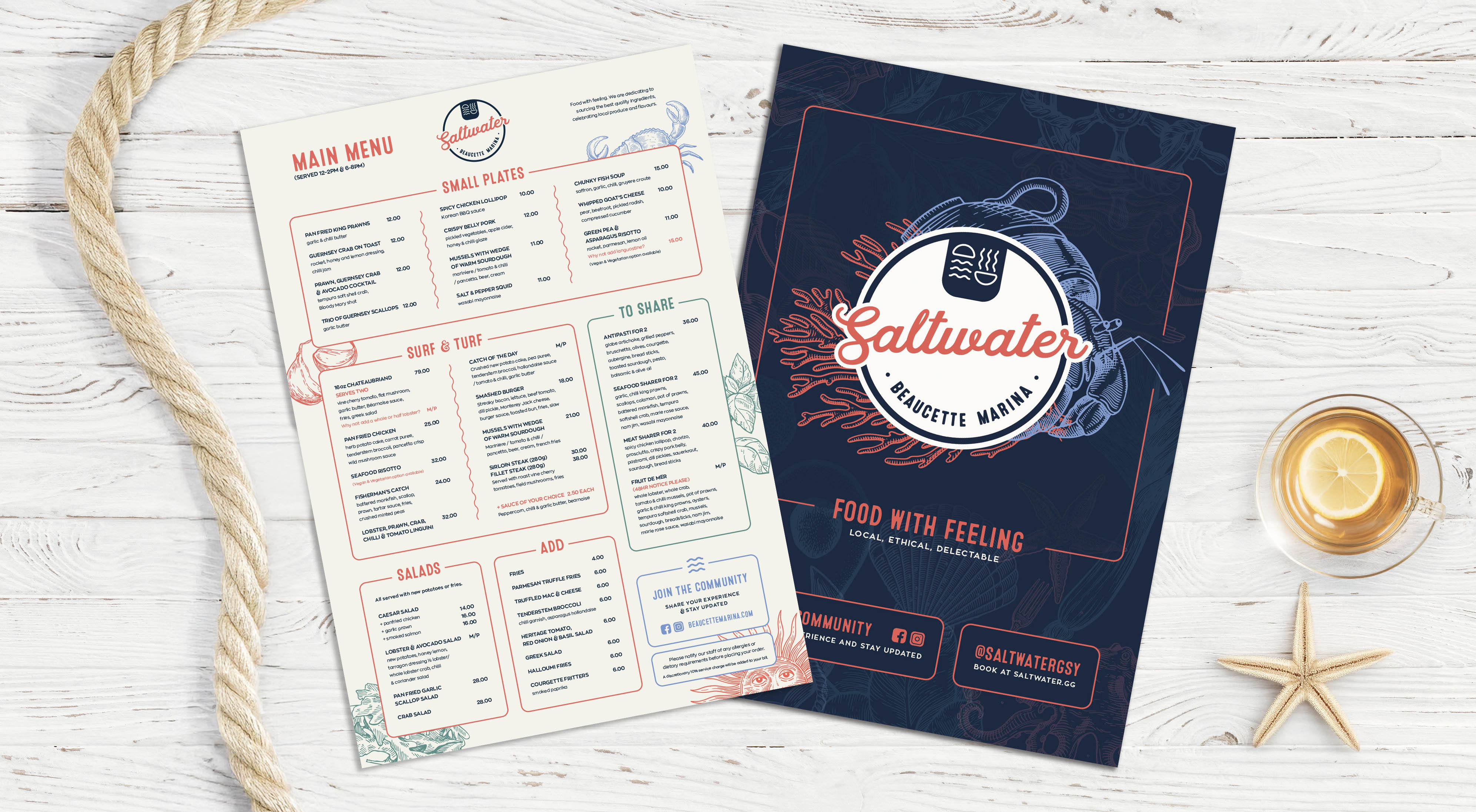
We built the identity around a sunrise over the water. It is what Beaucette is known for and it sets the tone: calm, welcoming, full of possibility. For Saltwater, the sunrise transforms into a warm bowl or cup, representing food and comfort. It also hints at the idea of taking a break and enjoying the moment — a subtle nod to the marina’s relaxed, boating lifestyle. The shared icon links the brands but allows each to have its own voice.
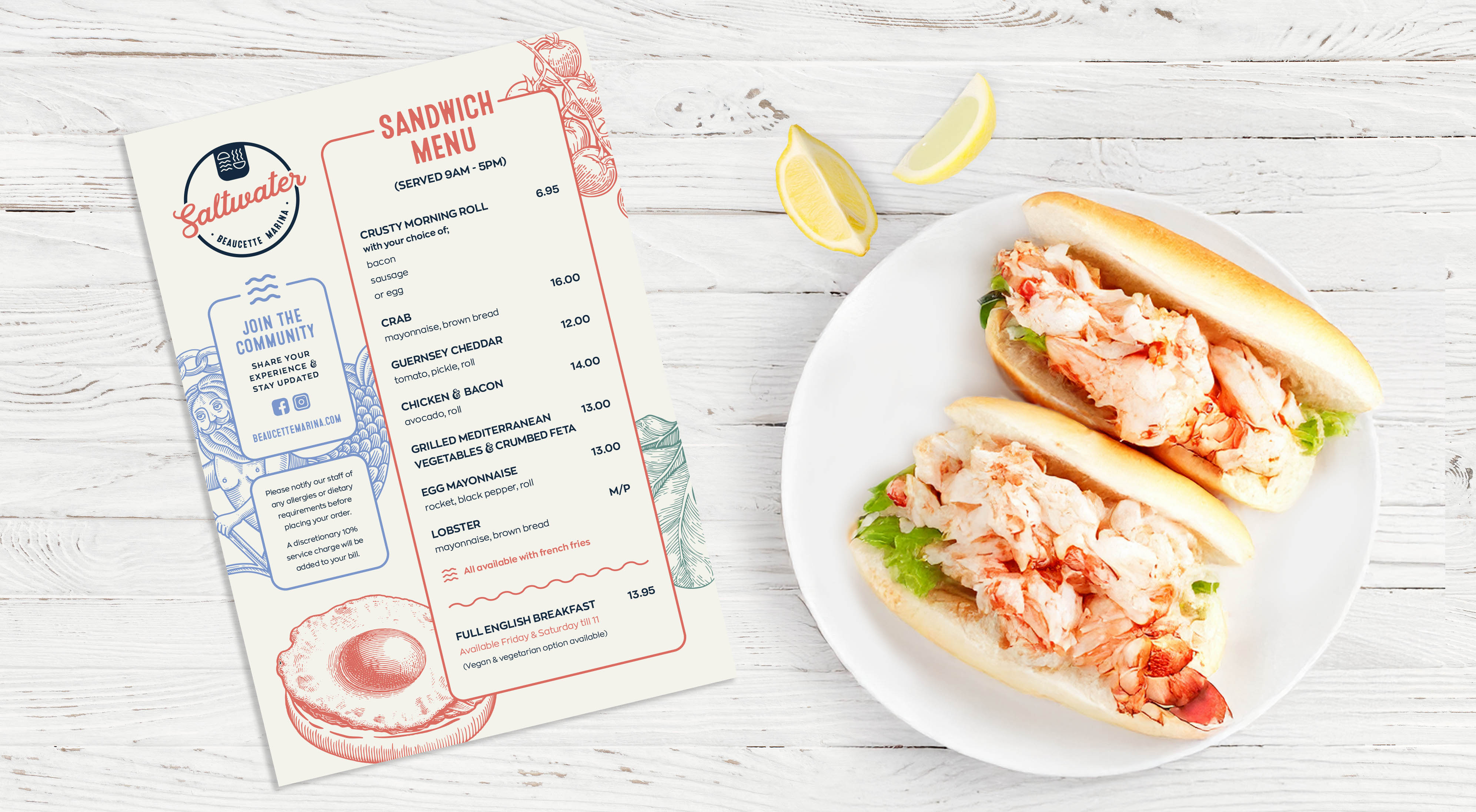
Typography and logo style
We looked for a balance between vintage warmth and modern clarity. The logo works as a badge or emblem and adapts easily across formats. It feels refined without being cold, perfect for a place that mixes relaxed coastal living with a high-end edge.
Colour palette
The colours came straight from the surroundings: navy, sea green, teal, coral red, taupe, cream and yellow. The mix feels coastal and vibrant but also warm and welcoming.
Illustrations
We created a suite of hand-drawn etching-style illustrations. For Beaucette, they celebrate boating culture and the marina lifestyle. For Saltwater, they highlight fresh ingredients and dining. Each set has its own tone but follows shared rules so everything stays consistent.
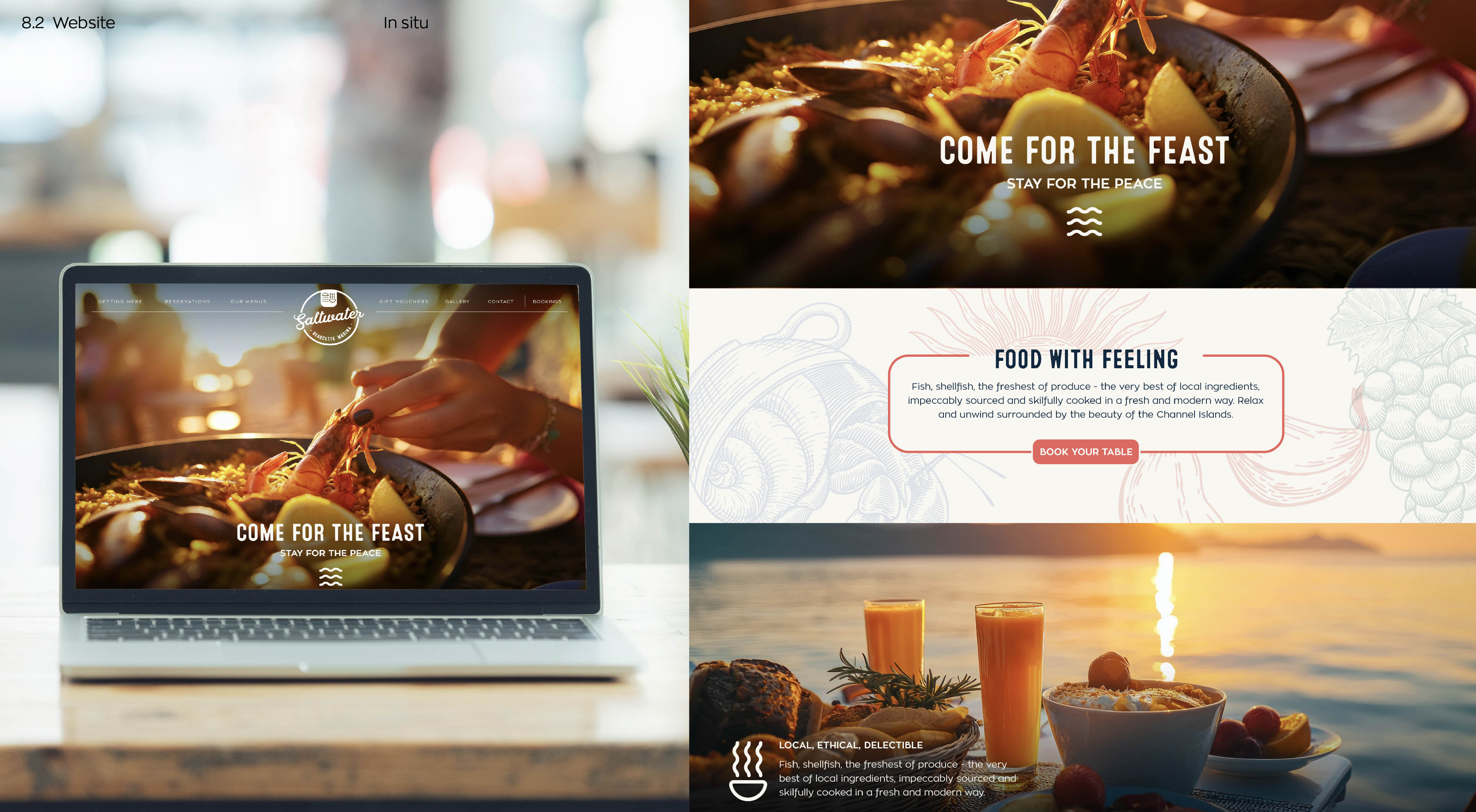
Photography direction
Rolling It Out
Beaucette now feels like a true destination. The marina and the restaurant feel connected but still distinct. The brand has the flexibility to grow into events and future spaces. Locals can see Beaucette as a place to get away from everyday life, even if it is just for a long lunch with a view.
What once felt a bit remote now feels like a hidden gem worth the journey, whether you’re arriving by car or by boat.
This was more than a logo refresh. It was about building a place brand. By creating a clear umbrella identity with flexible sub-brands, we helped Beaucette tell a bigger story: a modern marina, an inviting restaurant, and a community space with room to grow.
If you are looking to turn your space into a destination, we can help you build a brand that connects people to your place and makes them want to come back.