WEDDINGS
BESPOKE
TEMPlATED
GETTING STARTED
arrow_back

Some weddings follow a familiar script. Joanne and James chose to write their own legend. Joanne and James didn’t commission a single piece of stationery. They asked for a fully realised visual world where everything was designed to work together as one cohesive story.
For their wedding, I designed and created:
They made a deliberate decision to move away from a generic wedding aesthetic and instead create something deeply personal. Not themed, not following pinterest trends, but rooted in the stories, imagery, and worlds they genuinely love. That choice shaped every design decision and is exactly what made their wedding feel unforgettable.
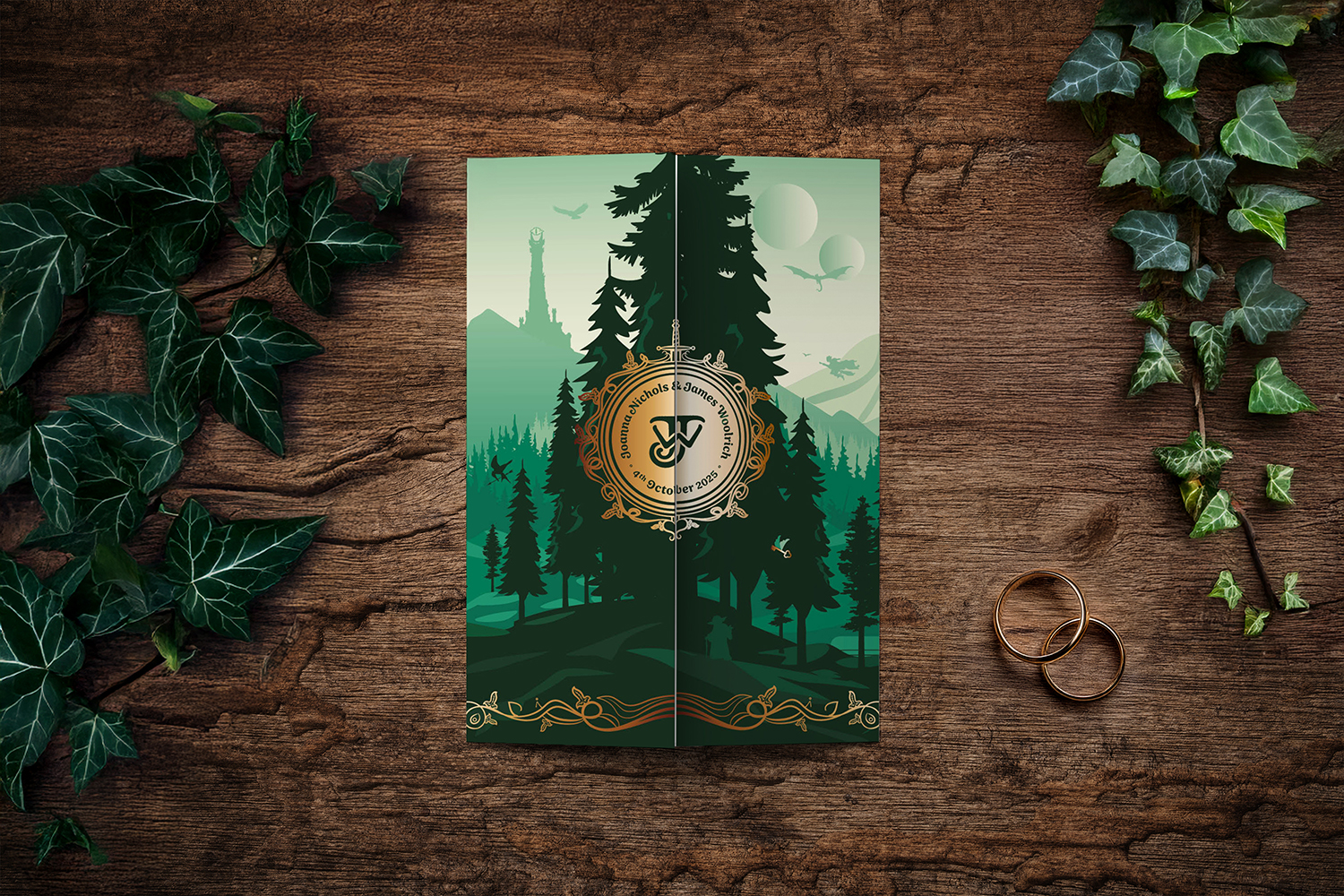
The foundation of the design began with typography. The typeface chosen was Sirenia, selected specifically to echo the fantasy poster styles Joanne and James were drawn to. It carries a subtle nod to epic fantasy, with echoes of Lord of the Rings without feeling pastiche or theatrical. This typeface became the backbone of the entire suite, ensuring consistency across every printed and physical element, from invitations to signage.
From the typography, we developed a bespoke icon.Inspired by ornamental door icons the couple saw in Barcelona on holiday and shaped to mirror the typeface letterforms, the icon was designed as a sigil rather than a logo. Two J’s, one for James and one for Jo, were combined to form a new singular J over a W, representing their union. This mark appeared subtly throughout the suite, woven into layouts rather than placed overtly.
It felt symbolic, intentional, and quietly powerful.
Opening the gatefold invitation was designed to feel like stepping into another world.
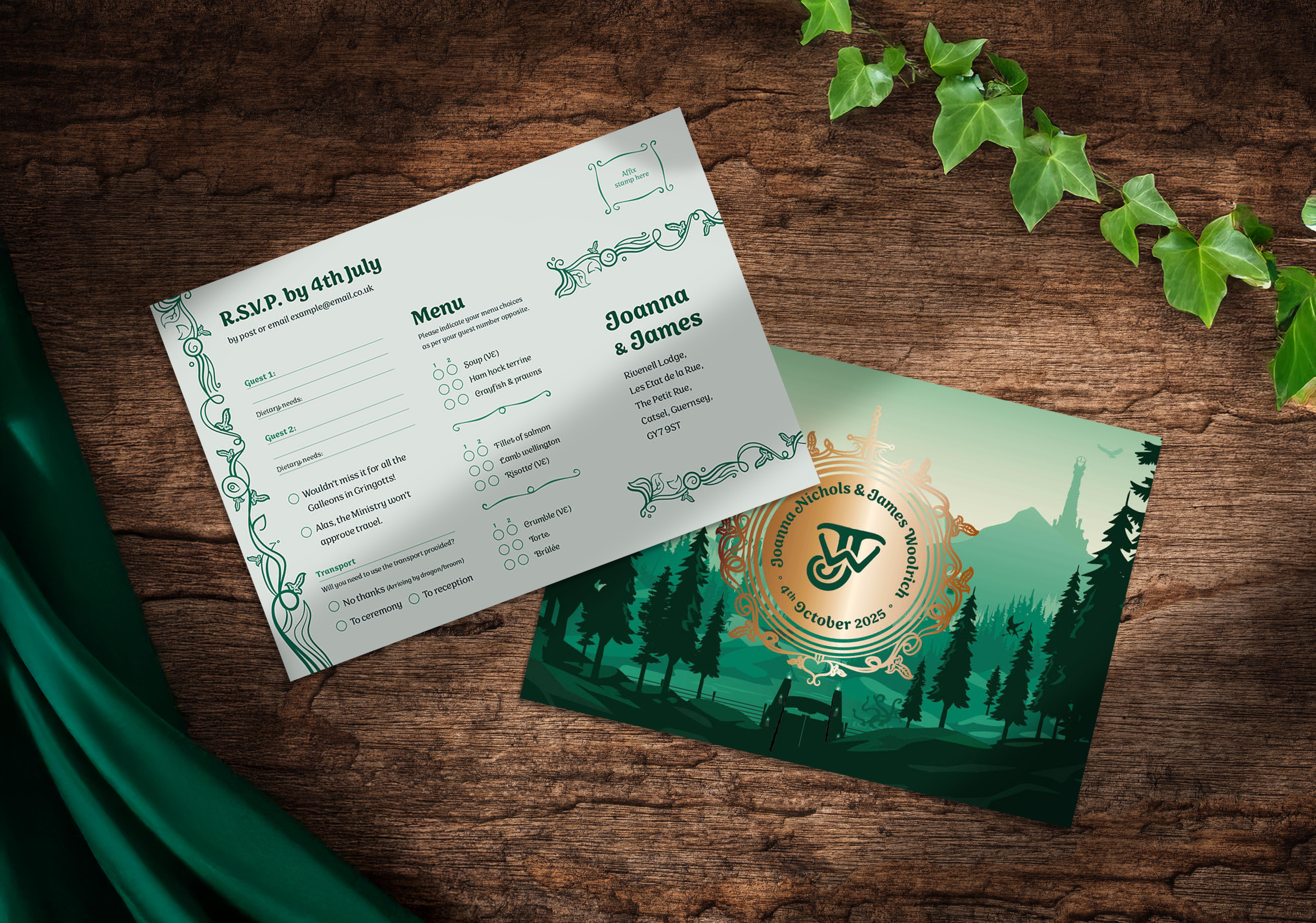
The interior layout was inspired by the Doors of Durin from Lord of the Rings. A series of illustrated arches housed the invitation details, creating a sense of structure and ceremony. These arches were wrapped in hand-drawn ivy, a motif requested by the couple and used throughout the entire design system. Hidden within the text language were subtle references to their favourite fandoms, not obvious at first glance, but rewarding for those who noticed them. It was storytelling through typography and layout rather than imagery alone.
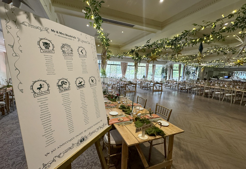
At the heart of the stationery was a fully bespoke illustrated scene, created to amalgamate all of Joanne and James’ favourite fictional worlds into one cohesive landscape. Rather than isolating references, everything existed together in a single imagined realm inspired by their favourite franchises and stories.
Each element was designed to be evocative rather than literal, allowing the illustration to reference multiple fandoms without ever crossing into imitation. The layered, paper cut-out style and restrained colour palette gave the entire scene a vintage poster feel, exactly as Joanne and James had envisioned.
This illustrated world didn’t stop at the invitation. The table plan expanded the story further, with tables named after their favourite worlds and illustrated using symbolic imagery. A quiet detail sat at the base: “No admittance except on party business.” A knowing nod for those who recognised it.
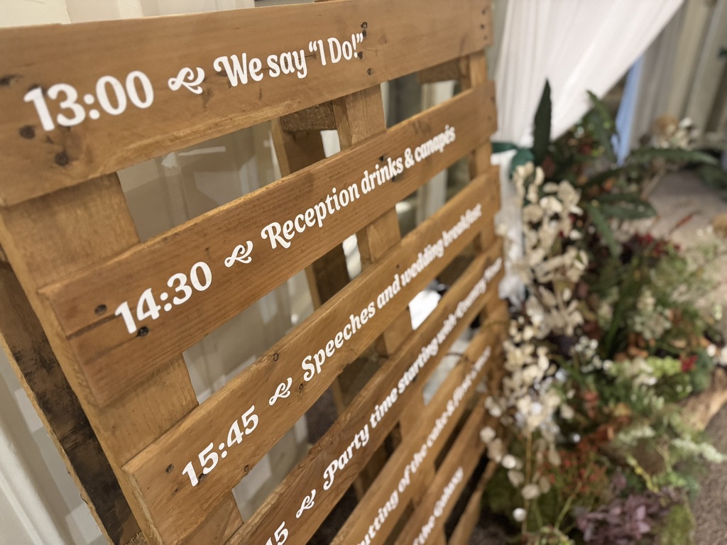
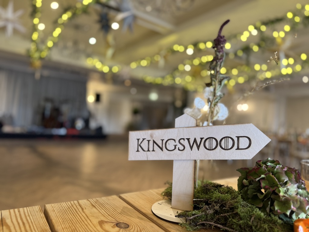
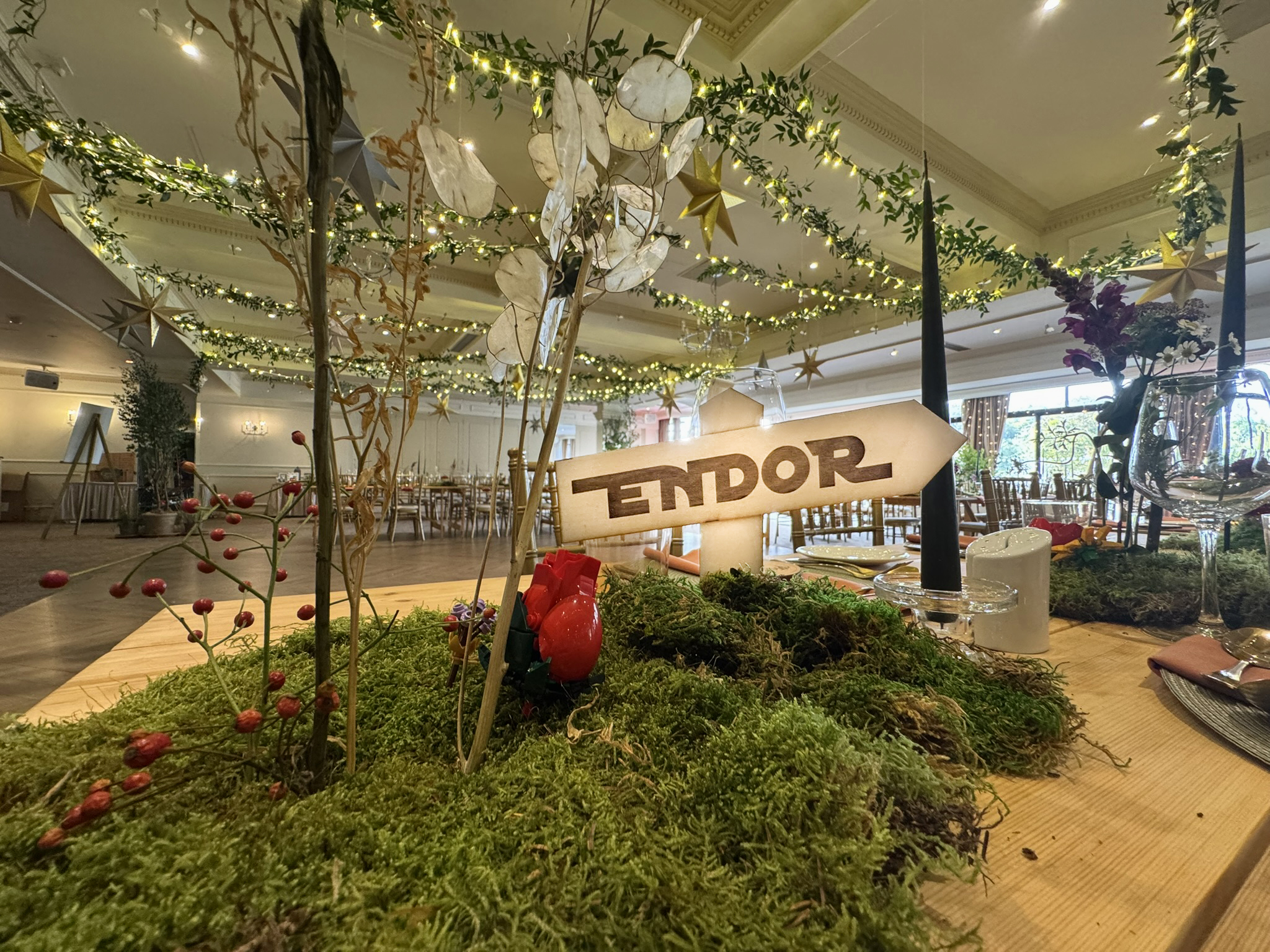
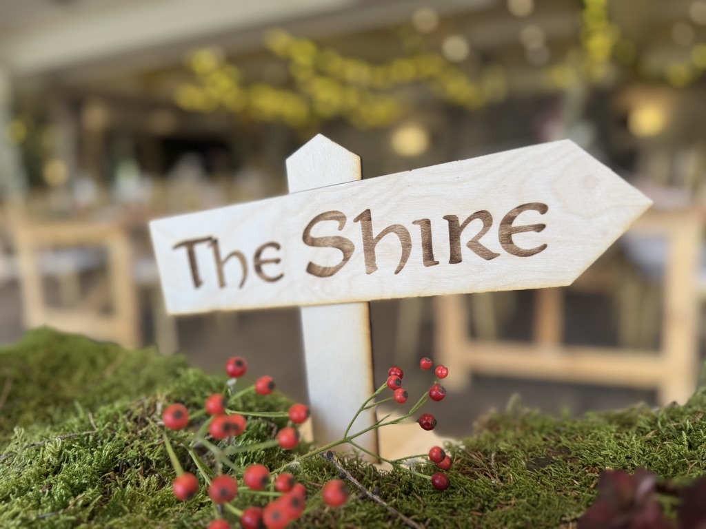
Table names became laser-cut directional signs, which were laid on beds of moss like waymarkers on a forest path. The welcome sign was created from a recycled wooden pallet, hand-lettered in the same bespoke typography for that authentic rustic feeling. These pieces now live on in their home, long after the wedding day.
Joanne and James didn’t choose what weddings are supposed to look like. They chose what felt right to them.
That decision meant their wedding:
They were over the moon with the final result, and the trust they placed in the process allowed this project to become something truly special.
If you’ve ever felt like traditional wedding aesthetics don’t quite fit, this is proof that you don’t have to compromise. Your wedding can be a reflection of your stories, your influences, and your shared imagination.I specialise in bespoke wedding design for couples who want something intentional, meaningful, and entirely their own. No templates or generic styling...just carefully crafted design that helps you build a world your guests will remember.
If you’re dreaming of a wedding that feels more like a legend than a checklist, I’d love to help you bring it to life.