WEDDINGS
BESPOKE
TEMPlATED
GETTING STARTED
arrow_back

Some weddings shout, others whisper beautifully. Philippa and Thomas were firmly in the second camp.
When they came to me, they already had their wedding invitations designed. With Philippa’s father being a designer, the stationery had already set a strong visual foundation. My role was to take that existing theme and translate it into cohesive, on-the-day signage that felt intentional, elegant, and perfectly at home in their surroundings.
The brief was clear:
• Classic and clean design
• A subtle rustic influence
• Natural materials and texture
• Nothing overly decorative or busy
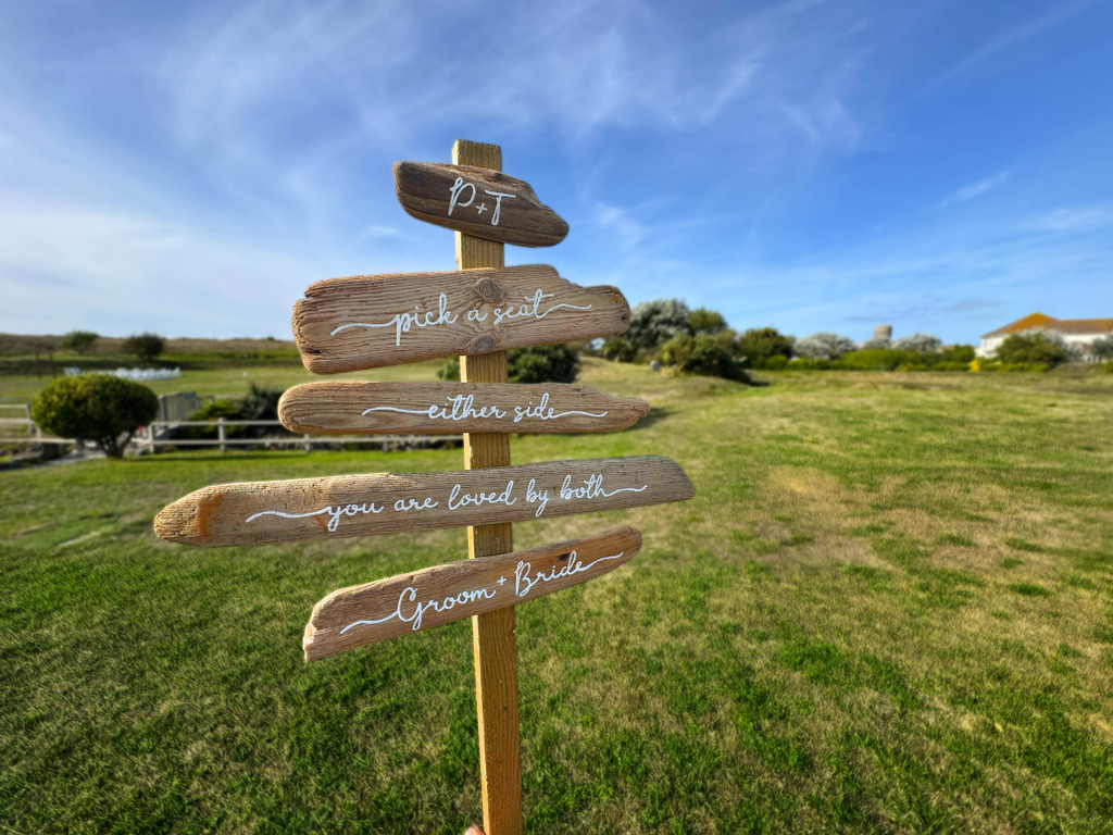
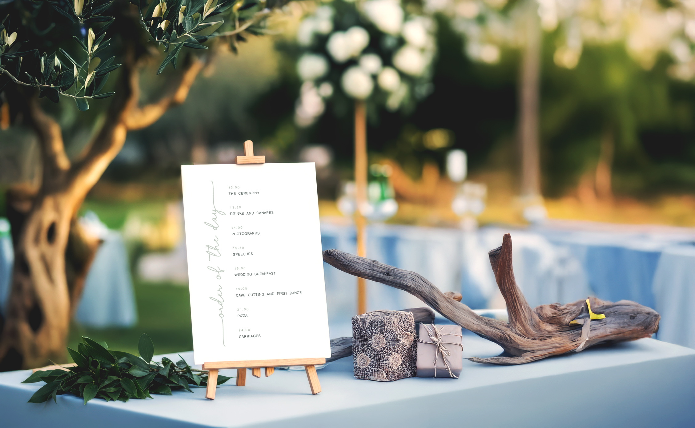
Natural materials were central to the overall look, adding warmth and tactility to an otherwise minimal design approach. Driftwood, in particular, became a recurring motif throughout the day.
The signage elements included:
• A driftwood pick a seat sign to greet guests on arrival
• A table plan, setting a relaxed and welcoming tone
• Driftwood table names, acting as both signage and sculptural décor
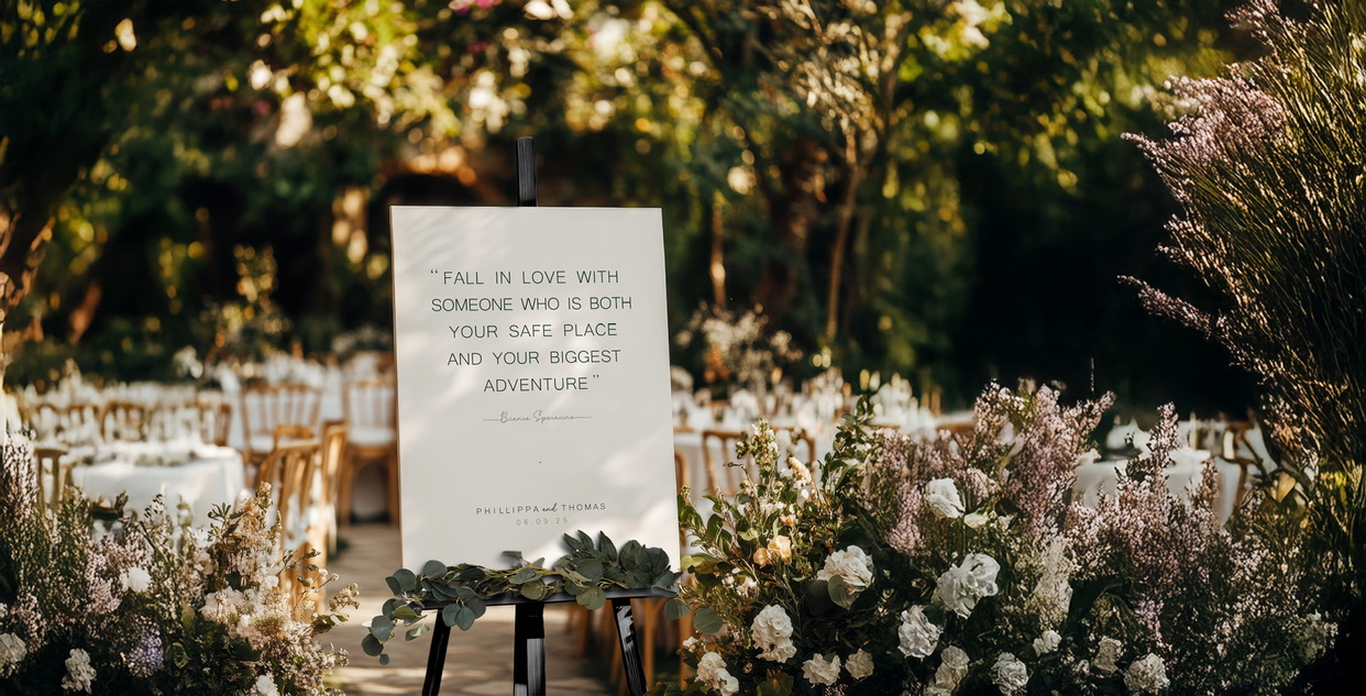
• A second welcome sign for the reception, featuring a meaningful quote chosen by the couple
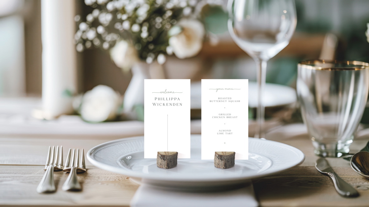
• Tower style Placecards for a sophisticated aesthetic
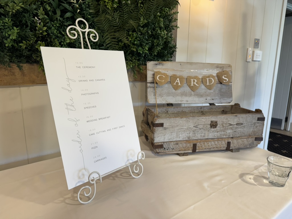
• Mini order of the day sign for the guest book area
Each piece was designed to feel considered and calm, allowing the natural grain and texture of the wood to do much of the visual work.
Typography played a key role in maintaining the clean aesthetic while adding subtle elegance.
The typographic approach:
• A clean sans serif typeface for the majority of text, keeping everything modern and legible
• A monoline script used sparingly for headings and highlighted titles
• Plenty of white space to ensure the designs felt light and uncluttered
This combination created contrast without overwhelming the simplicity of the overall design.
The colour palette was intentionally muted, chosen to complement both the stationery and the venue. Rather than competing with the styling, the signage was designed to sit harmoniously alongside florals and foliage.
Key design considerations included:
• Soft, neutral tones that aligned with the wedding theme
• Layouts that allowed space for flowers and greenery on easels
• Textured, natural-feel papers for printed items
An A3 order of the day was also created for display on the present table, offering guests a clear overview of the day while remaining visually consistent with the rest of the signage.
Functionality was just as important as aesthetics. The table plan and place cards were designed to be easy to navigate while still feeling special.
On-the-day details included:
• A clean, easy-to-read table plan
• Individual place cards held in natural log slices, tying back to the rustic materials used elsewhere
These small details added warmth and texture to the tables without detracting from the clean overall look.
Sustainability and material choice were considered throughout the process.
Where possible, we used:
• Recycled or repurposed materials, such as driftwood
• Natural or textured stocks for printed signage
• Design-led restraint rather than unnecessary embellishment
Philippa and Thomas were delighted with the final outcome. The signage blended seamlessly into their day, enhancing the setting without drawing attention away from the celebration itself.
This was a wedding defined by:
• Clean, timeless design
• Natural materials used with purpose
• Subtle elegance rather than statement pieces
Sometimes the most effective design doesn’t demand attention. It simply belongs.